Chapter 15 — Data Visualization with Matplotlib
15.0. Data visualization
matplotlib is a Python library for creating static, interactive, and animated visualizations. Here we are going to use going to use our mcdi dataset to create commonly used plot types including bar, histogram, line and scatter plots. To begin make sure to import the matplotlib module as follows.
import matplotlib.pyplot as pltTyping matplotlib.pyplot every time is annoying, so it is pretty standard to see people create the plt alias.
15.1. Simple line plots
Line plots visualize the relationship between two numerical variables. They are useful for spotting trends and patterns in the data.
The simplest way to create a line plot is just to call the plt.plot() function, and pass it in a list of x-coordinates, and a list of y-coordinates, and it will draw the line plot.
Let’s combine that with our new pandas skills to create a plot of the average MCDIp score from our dataset. Remember, the MCDIp score for each word is the percentage of children at a given age who say that word. So here, we are going to compute the average MCDIp score across all 500 words at each age.
So first we use a pandas statement to create a new dataframe that has that data, using the groupby() function and telling it we want the mean() of MCDIp.
# calculate the mean frequency for each age group
mean_mcdip_by_age = mcdi_df.groupby('Age')['MCDIp'].mean()
print(mean_mcdip_by_age)
Print Output:
Age
16    0.072588
17    0.089531
18    0.159805
19    0.210012
20    0.233139
21    0.271172
22    0.364170
23    0.417908
24    0.462604
25    0.513568
26    0.574354
27    0.593179
28    0.722286
29    0.662010
30    0.763803
Name: MCDIp, dtype: float64
You can see this gives us a DataFrame with only one column of data (the mean MCDIp score). It uses the groupby() variable (in this case, “Age”) as the index column. We can now use those two columns as our x and y variables to create a line plot. You can pass a matplotlib plot any iterable sequence of numbers, a list, an array, or a set. But the easiest thing to do is just to pass it a column from a pandas DataFrame. You can do this by just typing the name of the DataFrame followed by a period, followed by the column name. In this case, our column names are “index” and “values” because our DataFrame was a single column of data with an index.
# create scatter plot
plt.plot(mean_mcdip_by_age.index, mean_mcdip_by_age.values)
plt.show()
Output:
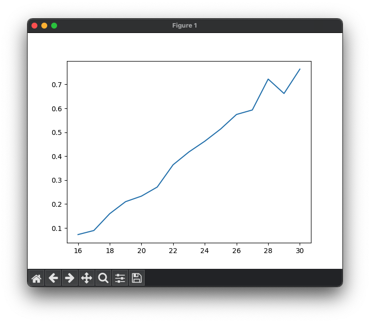
The plot connects the data points with lines, visualizing the relationship between age and mean word frequency. And while this is a nice first effort, the plot is quite bare. Most importantly, it violates the first rule of making scientific graphs: LABEL YOUR AXES!
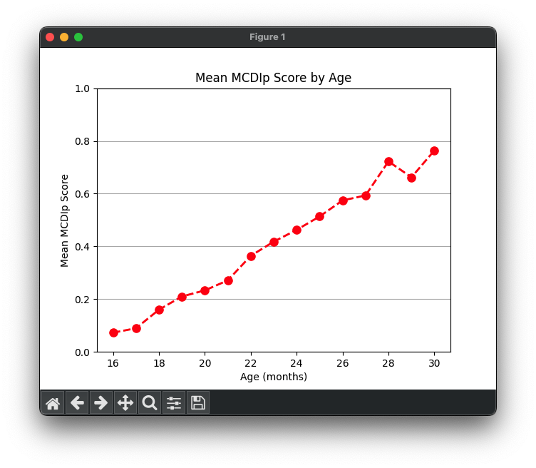
Luckily, we can add labels for each axis to improve the readability. Some options, like those specifying the color, thickness, and style of the line, and whether the line has markers at our data points, can be specified when you create the line. Other properties, like those labeling the axes and the figure itself, must be set separately.
plt.plot(mean_mcdip_by_age.index, mean_mcdip_by_age.values,
         color='red', linestyle='--', linewidth=2, marker='o', markersize=8)

# add labels and a title
plt.xlabel('Age (months)') # label the x axis
plt.ylabel('Mean MCDIp Score') # label the y axis
plt.ylim(0, 1) # force the y-axis to be from 0 to 1
plt.title('Mean MCDIp Score by Age') # give the figure a title
plt.grid(True, axis='y') # add horizontal gridlines

# show the plot
plt.show()
Output:
We can create a line plot that has more than one line. First, let’s create a new data frame that gets us the average at different ages of two of our variables.
cols_to_keep = ['MCDIp', 'LogFreq']
mean_df = mcdi_df.groupby('Age')[cols_to_keep].mean()
mean_df = mean_df.reset_index() # insert a new numbered index into the new DataFrame
print(mean_df)
output:
    Age     MCDIp   LogFreq
0    16  0.072588  2.403829
1    17  0.089531  2.455150
2    18  0.159805  2.532085
3    19  0.210012  2.585922
4    20  0.233139  2.639456
5    21  0.271172  2.688775
6    22  0.364170  2.735728
7    23  0.417908  2.775869
8    24  0.462604  2.853728
9    25  0.513568  2.888611
10   26  0.574354  2.919528
You can see that we created a list of the columns we wanted to keep, and used that list as the input input the groupby statement.
Now we can use a for loop with zip() to add each column and its corresponding color to the plot:
cols_to_keep = ['MCDIp', 'LogFreq']
mean_df = mcdi_df.groupby('Age')[cols_to_keep].mean()
mean_df = mean_df.reset_index() # insert a new numbered index into the new DataFrame

# Loop through the word statistics and plot each one
colors = ['blue', 'orange']
num_cols = len(cols_to_keep)
for color, col in zip(colors, cols_to_keep):
    plt.plot(mean_df['Age'], mean_df[col],
             label=col, color=color, linestyle='--', linewidth=2, marker='o', markersize=8)

# add labels and a title
plt.xlabel('Age')
plt.ylabel('Mean')
plt.title('Mean by Age')

plt.legend() # add a legend
plt.grid(True, axis='y') # add horizontal grid lines

plt.show() # show the plot
Output:
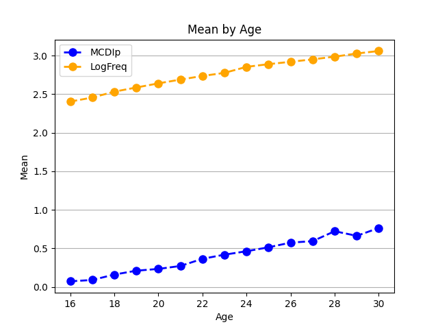
We can see, not surprisingly, that the cumulative frequency of a word (how many times it has occurred in speech to children) goes up over time, as does the percentage of children who say each word.
Want to customize your line plots even more? Check out the documentation page here: https://matplotlib.org/stable/api/_as_gen/matplotlib.pyplot.plot.html
15.2. Scatterplots and histograms
Histograms
Sometimes we want to get a sense of the range of scores or values for a given variable in our dataset. We can do this by plotting a histogram. Histograms are a graphical representation of the distribution of individual variables within a dataset. They display data in a series of bins or intervals, where the height of each bar represents the number of data points that fall into that bin (aka, the counts or frequencies). Histograms help us visualize the underlying frequency distribution of the data and can give insights into the data’s central tendency, dispersion, and skewness.
For instance, let’s plot a histogram of the frequency variable in our MCDI dataset:
# Plot a histogram of word frequency
plt.hist(mcdi_df['LogFreq'], bins=20)
plt.xlabel('Word Frequency')
plt.ylabel('Count')
plt.title('Histogram of Word Frequency')
plt.show()
Output:
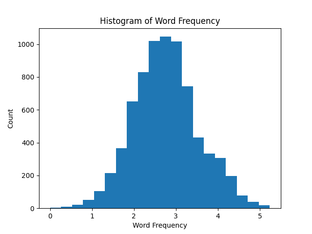
This histogram shows that across all words and ages, word frequencies are normally distributed.
Additional customization and applications of histograms here: https://matplotlib.org/stable/gallery/statistics/hist.html
Scatterplots
The last graph we want to show is a scatterplot. Scatterplots are useful for visualizing the relationship between two numerical variables. They can help us identify trends, correlations, and potential outliers in the data. Here is a plot that examines the relationship between a words frequency and its MCDIp score.
mcdi_24_df = mcdi_df.query('Age == 24')

# Create a scatterplot
plt.scatter(mcdi_24_df['LogFreq'], mcdi_24_df['MCDIp'])

# Add labels and a title
plt.xlabel('Word Frequency')
plt.ylabel('MCDIp')
plt.title('MCDIp vs. Log Frequency')

# Show the plot
plt.show()
Output:
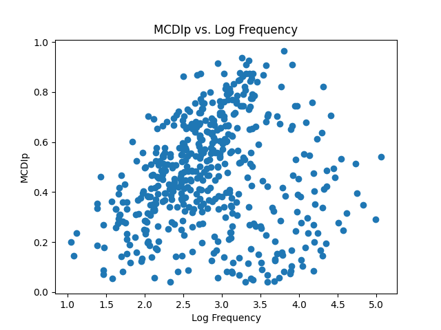
This graph has 500 different points, since there are 500 different words. It makes it hard to see that there is a strong relationship here. It is worth noting that this dataset not only contains nouns, but also function words, adjectives, and verbs. Maybe a relationship will become more apparent if we plot each type of word in a different color?
To do that, first we want to get the unique list of lexical classes. Then we can create a unique color for each one. Then we just loop through the lists and add each one to the scatterplot. Each time we make the scatterplot, we can specify the color of the dots using the ‘c’ parameter, and specify the label that will show up in the legend for those dots with the ‘label’ parameter.
lexical_classes = mcdi_24_df['Lexical_Class'].unique()
num_classes = len(lexical_classes)
colors = plt.cm.Set2(np.linspace(0, 1, num_classes))

for lexical_class, color in zip(lexical_classes, colors):
    class_data = mcdi_24_df.loc[mcdi_24_df['Lexical_Class'] == lexical_class]
    plt.scatter(
        class_data['LogFreq'],
        class_data['MCDIp'],
        c=color,
        label=lexical_class.replace('_', ' ').lower() # convert to lowercase, no underscores
    )

plt.legend() # Add a legend

# Add labels and a title
plt.xlabel('Log Frequency')
plt.ylabel('MCDIp')
plt.title('MCDIp vs. Log Frequency')

plt.show() # Show the plot
Output:
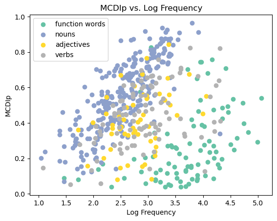
Now that’s a good-looking figure! You can now see a pronounced relationship with each class of words. The more frequently children hear specific nouns, the more likely children are to produce those nouns themselves. Ditto for verbs, function words, and adjectives. But this only holds within the grammatical categories. Function words like “the” and “and” are much more frequent than most nouns, but are produced less than nouns, and the same is true for verbs and adjectives. This is called “Simpson’s Paradox” (not named after Homer…). What looks like no correlation in a big dataset becomes one when that dataset is broken down into subgroups.
We can see this in numbers too, by computing the correlations in pandas:
# Compute the correlation across all rows
correlation = mcdi_24_df['MCDIp'].corr(mcdi_24_df['LogFreq'])
print(f"Correlation between MCDIp and LogFreq across words: {correlation:.2f}")

grouped = mcdi_24_df.groupby('Lexical_Class')
for name, group in grouped:
    correlation = group['MCDIp'].corr(group['LogFreq'])
    print(f"Correlation between MCDIp and LogFreq for {name}: {correlation:.2f}")
output:
Correlation between MCDIp and LogFreq across all rows: 0.13
Correlation between MCDIp and LogFreq for adjectives: 0.36
Correlation between MCDIp and LogFreq for function_words: 0.40
Correlation between MCDIp and LogFreq for nouns: 0.77
Correlation between MCDIp and LogFreq for verbs: 0.44
More on scatterplots can be found here: https://matplotlib.org/stable/api/_as_gen/matplotlib.pyplot.scatter.html
15.3. Bar plots
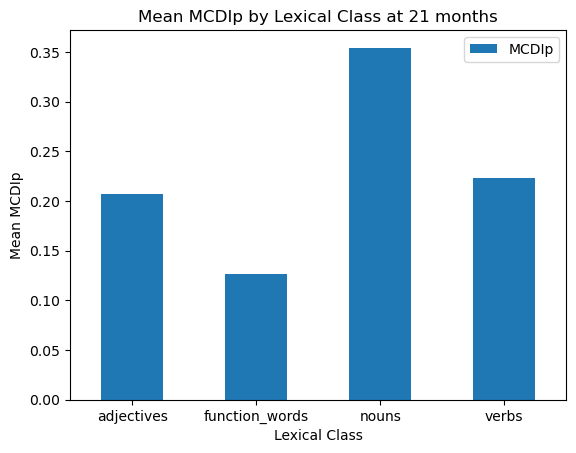
Bar plots are useful for visualizing and comparing categorical data. Let’s start by creating another subset of our data: the data for only 21 month-olds, and averaging MCDIp separately for each grammatical class at that age.
mcdi_21_df = mcdi_df.query('Age == 21')
stats_by_class = mcdi_21_df.groupby('Lexical_Class')['MCDIp'].mean()
print(stats_by_class)
output:
Lexical_Class
adjectives        0.207079
function_words    0.126022
nouns             0.354411
verbs             0.222982
Name: MCDIp, dtype: float64
mcdi_21_mean_df = mcdi_21_df.groupby('Lexical_Class', as_index=False)['MCDIp'].mean()
# Now plot using the aggregated data
mcdi_21_mean_df.plot.bar(x='Lexical_Class', y='MCDIp', rot=0)
plt.xlabel('Lexical Class')
plt.ylabel('Mean MCDIp')
plt.title('Mean MCDIp by Lexical Class at 21 months')
plt.show()Output:
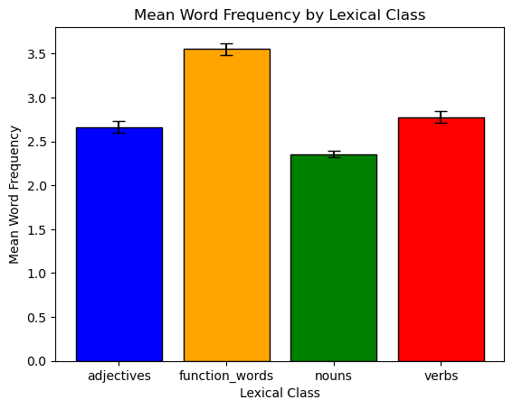
We could make this graph look a little nicer, with some different colors and error bars. We calculate standard error bars (the standard deviation divided by the square root of the sample size) using another pandas groupby operation. Note that we are using the same data as before, but we are now calculating the standard error for each lexical class.
import numpy as np
# Calculate the standard error and 95% confidence intervals for each lexical class
n_by_class = mcdi_21_df.groupby('Lexical_Class')['LogFreq'].count()
stderr_by_class = mcdi_21_df.groupby('Lexical_Class')['LogFreq'].std() / np.sqrt(n_by_class)
mean_freq_by_class = mcdi_21_df.groupby('Lexical_Class')['LogFreq'].mean()

# Set custom colors
colors = ['blue', 'orange', 'green', 'red']

# Plot the bar chart with error bars
plt.bar(mean_freq_by_class.index, mean_freq_by_class.values,
        yerr=stderr_by_class, color=colors, capsize=5, edgecolor='black')

# Add labels and a title
plt.xlabel('Lexical Class')
plt.ylabel('Mean Word Frequency')
plt.title('Mean Word Frequency by Lexical Class')

# Show the plot
plt.show()
Output:
You can find additional information about bar plots and customization here: https://matplotlib.org/stable/api/_as_gen/matplotlib.pyplot.bar.html.
15.4 Subplot figures
Now that we have talked about creating simple matplotlib plots, it’s time to talk about creating more complex figures. In this section we’ll go over three things: 1) additional ways you can customize your figures; 2) how to create figures with multiple plots in the same figure; and 3) how to save figures directly to a file. For the first two, we will introduce the subplots() function, which is used to create multiple plots in a single figure.
Multiple plots on the same figure
To create a subplot figure in matplotlib, let’s first generate some quick data to use as an example:
import matplotlib.pyplot as plt
import pandas as pd
import numpy as np

x = np.random.normal(100, 20, 50)  # create a random array of 50 normally distributed numbers
y = x + np.random.normal(10, 10, 50)  # create a second array that will be correlated with the first one
z = y + np.random.normal(10, 10, 50)  # create a third array that will be correlated with the second one
df = pd.DataFrame({'x': x, 'y': y, 'z':z})  # turn those three arrays into a pandas dataframe
print(df.head(10))
Output:
x y z
0 105.213450 116.168283 111.586334
1 97.990982 101.872151 103.467505
2 83.265683 100.975598 72.601834
3 82.318511 93.203049 71.576572
4 109.210605 99.683663 100.408998
5 90.448397 99.732173 67.437949
6 127.604686 125.473239 124.816922
7 112.825203 129.001598 92.179598
8 121.061036 120.242041 121.455901
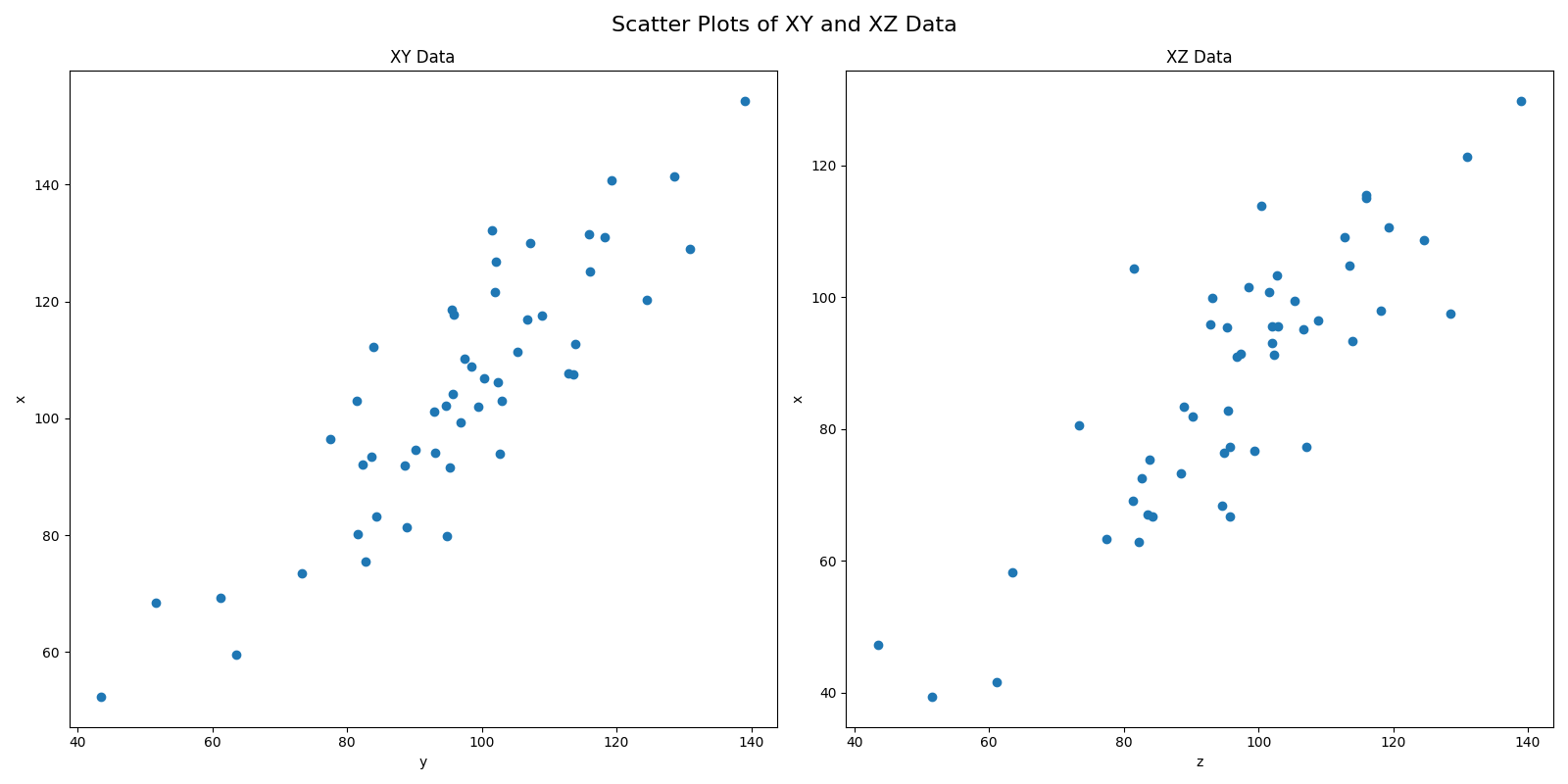
9 115.702167 133.936938 109.759181Now let’s create a scatterplot of X with Y, and another of X with Z, on the same figure. The first line creates the figure by specifying the number of rows and columns of subfigures you want (in our case, 1 row with 2 columns), and how big you want to the figure to be, in inches. The function gives you back two variables: a figure object (containing the info about the overall figure), and an axs object, which is a matrix of “axes subfigures”, in other words, the subfigures themsevles, which you can access through indexing the same way you would a numpy array. So in our case, because our shape is [1,2], we can access the left subplot with [0] and the right subplot with [1]. When then use that on the next lines to create a scatterplot on each subplot (specifying the x and y data for each). Then we can modify properties of the subplots and figure itself.
fig, axs = plt.subplots(1, 2, figsize=(16, 8))

axs[0].scatter(df['x'], df['y'])
axs[1].scatter(df['x'], df['z'])

axs[0].set_title('XY Data')
axs[0].set_xlabel("y")
axs[0].set_ylabel("x")

axs[1].set_title('XZ Data')
axs[1].set_xlabel("z")
axs[1].set_ylabel("x")

fig.suptitle("Scatter Plots of XY and XZ Data", fontsize=16)
fig.tight_layout()
plt.show()
Output:
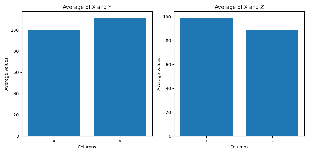
Here is an example with bar plots. It can be smart to name the resulting variables something more descriptive.
bar_fig, bar_axs = plt.subplots(1, 2, figsize=(10, 5))

# create bar plot of averages of 'x' and 'y' columns
bar_axs[0].bar(['x', 'y'], [df['x'].mean(), df['y'].mean()])
bar_axs[0].set_title('Average of X and Y')
bar_axs[0].set_xlabel('Columns')
bar_axs[0].set_ylabel('Average Values')

# create bar plot of averages of 'x' and 'z' columns
bar_axs[1].bar(['x', 'z'], [df['x'].mean(), df['z'].mean()])
bar_axs[1].set_title('Average of X and Z')
bar_axs[1].set_xlabel('Columns')
bar_axs[1].set_ylabel('Average Values')

# adjust spacing between subplots
bar_fig.tight_layout()

# show the plot
plt.show()
Output:
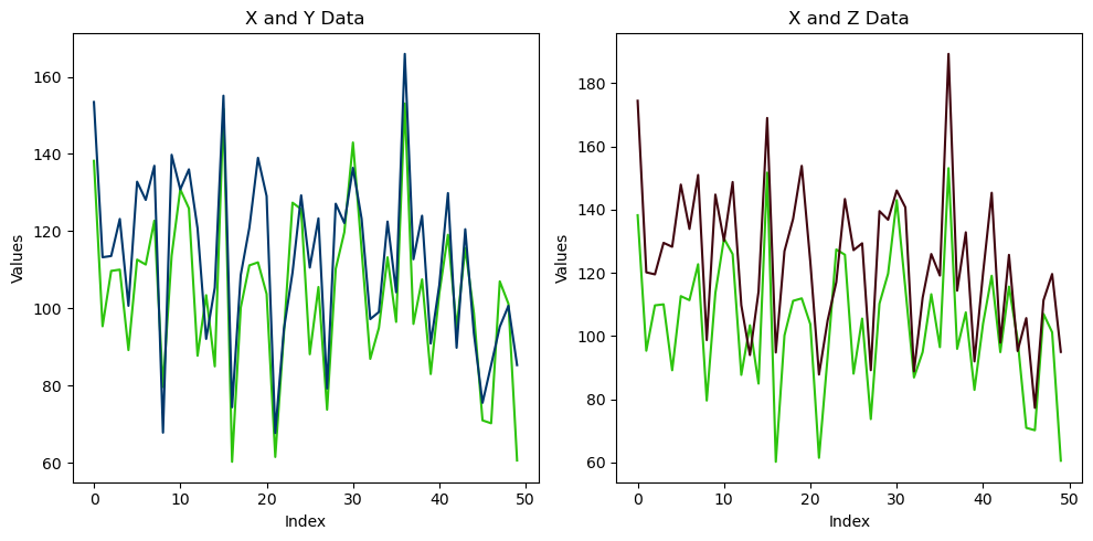
Here it is with line plots:
line_fig, line_axs = plt.subplots(1, 2, figsize=(10, 5))

# plot x and y data on left subplot
line_axs[0].plot(df['x'], color='#2DC40D')
line_axs[0].plot(df['y'], color='#00376B')
line_axs[0].set_title('X and Y Data')
line_axs[0].set_xlabel('Index')
line_axs[0].set_ylabel('Values')

# plot x and z data on right subplot
line_axs[1].plot(df['x'], color='#2DC40D')
line_axs[1].plot(df['z'], color='#410610')
line_axs[1].set_title('X and Z Data')
line_axs[1].set_xlabel('Index')
line_axs[1].set_ylabel('Values')

# adjust spacing between subplots
line_fig.tight_layout()

# show the plot
plt.show()
Output:
Saving your figures
After creating and customizing your visualizations, you may want to save them as image files to use in presentations, reports, or other documents. matplotlib provides a simple way to save your plots as various image formats, such as PNG, JPEG, SVG, and PDF, using the savefig() function. You can do this with both the simple plots and the more complex subplot figures.
# Create a simple line plot
plt.plot(mean_freq_by_age.index, mean_freq_by_age.values)

# Add labels and a title
plt.xlabel('Age (months)')
plt.ylabel('Mean Word Frequency')
plt.title('Mean Word Frequency by Age')

plt.savefig('line_plot.png') # Save the plot as a PNG file
plt.savefig('line_plot_highres.png', dpi=300) # Save the plot as a high-resolution PNG file
plt.savefig('line_plot.pdf') # Save the plot as a PDF file
plt.savefig('line_plot.svg') # Save the plot as an SVG file

# Close the plot (optional, but useful if you are creating multiple plots in a loop)
plt.close()
Note that we put plt.close() at the bottom here. If you are creating multiple plots in the same chunk of code, this is a way to make matplotlib forget everything about the previous plot before you start the next one. If you are creating simple plots and saving them, it is good habit to end with this so an option for one doesn’t stay set when you create the next one. Alternatively, if you are creating subplot figures, and giving them separate names, this can be another way to keep this from happening.
15.5. Lab 15
def q1():
    print("\n#### Question 1 ####\n")
    """
    - Save the predict_mcdi.csv file located in the data/lab10 website on your local machine.
    - Create a variable in your main function with the location of that file on your machine, and pass it into this
        function.
    - Rename this function "load_dataset", and have it receive the file location as an input argument named "file_path"
    - Have this function load the file indicated by "file_path" and create a pandas dataframe out of it
    - Print the dataframe, and return it back to the main function, saved there as mcdi_df
    """


def q2():
    print("\n#### Question 2 ####\n")
    """
    - Modify this function so it is named "subset_data_by_age"
    - Have the function take two arguments, "df" and "age".
    - Have this function create a new dataframe that is a subset of the full dataframe, but containing only the data
        for the age that is passed into the age variable.
    - Print the new dataframe, and return it back to the main function
    - In the main function, call this function and pass it the full dataframe and the value 24 for age. receive the
        resulting dataframe back into your main function named "mcdi24_df"
    """


def q3():
    print("\n#### Question 3 ####\n")
    """
    - Modify this function to have the name "get_mean".
    - Have this function receive a dataframe and a column name as an input arguments,
    - Have the function create a new dataframe containing the the mean value of the specified column.
    - Print the resulting dataframe, and return it back to the main function.
    - call this function from main, pass it mcdi24_df and MCDIp, and call the variable it receives back mcdip24_mean
    """


def q4():
    print("\n#### Question 4 ####\n")
    """
    - Modify this function to have the name "get_word_stats"
    - Have it receive three input arguments: df, word, statistic
    - Have the function create a new dataframe which is the data only for the specified word and statistic, at each age
    - Print the df and and return it to the main function as "word_stat"
    - Call this function from main, and pass it a word and statistic of your choice
    for example, if the input word was "sock" and the statistic was "MCDIp", the resulting df would be:
        Age
        16    0.300209
        17    0.216117
        18    0.441177
        19    0.472561
        20    0.459854
        21    0.443350
        22    0.505000
        23    0.595420
        24    0.718696
        25    0.750751
        26    0.828729
        27    0.779487
        28    0.946048
        29    0.787879
        30    0.898305
Name: MCDIp, dtype: float64
    """


def q5():
    print("\n#### Question 5 ####\n")
    """
    - Rename this function "get_corr_by_age", and give it three input arguments: df, stat1 and stat2
    - Have the function create a new dataframe that has the correlation of the two specified statistics separately for
        each age
    - Print the resulting dataframe, and pass it back to the main function
    - Call this function from main(), pass in the full dataframe, and the values "LogFreq" and "MCDIp".
    Your result should be:
                Age  Correlation
            1    16     0.212248
            3    17     0.206795
            5    18     0.184279
            7    19     0.167496
            9    20     0.163828
            11   21     0.130066
            13   22     0.164553
            15   23     0.162973
            17   24     0.129188
            19   25     0.122507
            21   26     0.160319
            23   27     0.144281
            25   28     0.113585
            27   29     0.159692
            29   30     0.131319
    """


def q6():
    print("\n#### Question 6 ####\n")
    """
    - Create a list with four words on it that are in the MCDI dataset
    - Create a loop that loops over the list, and each time calls your get_word_stats() function, passing it
        the full dataframe, the word, and the statistic "MCDIp".
    - Use the resulting dataframes to create a line plot with four lines, showing the values of MCDIp for each word
        at each age
    - Don't forget to label your figure, the axes, and include a legend.
    """


def q7():
    print("\n#### Question 7 ####\n")
    """
    - Create a list with three ages that are in the MCDI dataset.
    - Create a bar plot with the average MCDIp score at three different ages.
    - Use your subset_data_by_age() and get_mean() functions to accomplish this
    - Label your figure and axes!
    """


def q8():
    print("\n#### Question 8 ####\n")
    """
    - Create a figure with three subplots
    - The three subplots should all be histograms, containing the values of MCDIp, LogFreq, and
        ProKWo at 24 months
    - Label your figure, subplots, and axes!
    """


def q9():
    print("\n#### Question 9 ####\n")
    """
    - Create a figure with two subplots
    - The two subplots should be scatterplots of LogFreq x MCDIp at 24 months, and ProKWo x MCDIp
        at 24 months
    - Label your figure, subplots, and axes
    """


def q10():
    print("\n#### Question 10 ####\n")
    """
    - Create one more figure of your choice using the MCDIp dataset, different from the others we
    have made so far. It's okay to create any kind of plot you want — scatterplot, bar plot,
    line plot, etc., using variables from the MCDIp dataset, so long as it's different from the
    ones in the other questions.
    """

def main():
    q1()
    q2()
    q3()
    q4()
    q5()
    q6()
    q7()
    q8()
    q9()
    q10()


if __name__ == "__main__":
    main()
15.6. Homework 15
For Homework 15, you are going to analyze and visualize the data we collected in our memory experiment. Here is what you need to do:
Create a
figures/folder inside theExperiment/folderGet the data
- Download the data in
data/hw4/data.zip(note that the folder is hw4, but here we’re going to think of it as hw15). - Unzip it in the data directory of your
Experiment/folder from last week. Make sure to delete the zip file when unzipped.
- Download the data in
In the Experiment’s
src/directory, create a file calledanalysis.py. Make sure it has amain()function and anif __name__ == "__main__"statement and all that, like a good Python script. In the file, in addition tomain(), define the following functions (note that you will need to give some of these functions input arguments, based on the instructions below):import_data(): which will open the files and create a pandas DataFrame out of them. Note that this is a bit different than in the lab. There are multiple files, not just one, so you have to deal with that somehow.clean_data(): You will need to do some preprocessing of the data, largely the columns. Depending on your version of Pandas, you may also need to specify that certain columns are floats, or strings, or what have you for later analysis. It would also be helpful for later steps to convert thestimulus_condcolumn to string values, mapping 0 to “new” and 1 to “old”.trim_outliers(): takes the full DataFrame and removes any trials where the RT is more than 2 seconds long. Shouldreturnthe DataFrame back tomain()get_summarized_means(): takes the trimmed DataFrame and anaverage_overparameter, whereaverage_overmust be eitherparticipant_id,stimulus, ortrial_number. The function will then create a new DataFrame containing the average performance of each subgroup on whateveraverage_overcolumn name it is passed, averaging over the other two variables. In other words:- if it is passed
participant_id, then the resulting DataFrame columns should be:[participant_id, exp_condition, stimulus_cond, mean_response, mean_accuracy, mean_rt]. - if it is passed
stimulus, then the resulting DataFrame columns should be:[stimulus, exp_condition, stimulus_cond, mean_response, mean_accuracy, mean_rt]. - if it is passed
trial_number, then the resulting DataFrame columns should be:[trial_number, exp_condition, stimulus_cond, mean_response, mean_accuracy, mean_rt].
- if it is passed
create_participant_histograms(): create a single figure with two subplots, one containing a histogram of the participants’ mean accuracy, and one containing a histogram of the participants’ mean RT. Use the function you created in 4) to get the correct data. But you will need to average it further, since that DataFrame will have multiple rows per subject (one for combination ofexp_conditionanditem_cond). Save the figure in thefigures/folder. Don’t forget to label your figure, subplots, and axes. call this function from your main function.create_participant_bars(): creates a single figure with two subplots, each one a bar plot. The first bar subplot should show the mean accuracy (with standard error bars on each bar) as a function of 2x2 experiment design (words vs. pictures X old items vs. new items). In other words, there should be four bars:- one for the average accuracy of “old” trials when the stimulus was a word (text)
- one for the average accuracy of “old” trials when the stimulus was a picture (image)
- one for the average accuracy of “new” trials when the stimulus was a word (text)
- one for the average accuracy of “new” trials when the stimulus was a picture (image) the second subplot should be the exact same as the first, except averaging RT instead of accuracy. Use the function you made in #4 to get the correct data. Save the figure in the
figures/folder. Don’t forget to label your figure, subplots, and axes. call this function from your main function. However, as the conditions are set to 0 (new) or 1 (old), you will need to convert them to “new” or “old” for the plot.
create_trial_results_line_plot(): creates a single figure with two subplots, each one a line plot. The first line plot should have four lines, showing the average accuracy in the four conditions (same as in #6) but this time broken down by trial number. In other words, you should have four lines with 20 pts each (one for the average accuracy performance on each trial). The second subplot should be the same, but using RT instead of accuracy. Use the function in #4 to get the right data. Don’t forget to label your figure, subplots, and axes. call this function from yourmain()function.
When you are done. Zip your experiment directory and rename it lastname_first_name_hw15.zip, and submit it on the course website (Canvas).